 The second part of our ancillary task is to produce a poster for our film 'Seized'. The poster for a film is an important aspect in promoting it to a wide audience and selling the film as a 'must see'. Below is three different posters which were produced for the action-thriller film 'Taken'. Throughout the production of making our film trailer we have focused upon the creation of the film 'Taken' and have therefore decided to look at the posters for the film. One of the posters is a French poster which has the words 'Il a 4 jours pour retrouver sa fille...' which translated into english means 'He has four days to find his daughter' giving the observer of this poster a clue as to the storyline in the film. Although the film is in English, it is set in France so therefore the producers of this film have chosen to make a poster which will appeal to a french audience. This poster shows the main male character running through the streets of Paris where his daughter has been abducted. He is shown to be running and to the left of this image is a faded image of his daughter to remind us what the film centers around. In bold, red text, the title of the film 'Taken' is written vertically to the left of the poster which immediately grabs the attention of the person reading it. I like this poster but I feel that it would be difficult to produce a poster similar to it as ours is less action packed, however I do like the use of another faded image layered on top of the existing image.
 Another poster which was made for the film 'Taken' shows the protagonist male character as the focal point and image of the poster. He is seen holding a gun and dressed smartly in a suit with a look of determination to find his daughter. I am not fond of this poster as it looks rather dull and the colour scheme is mainly greyish washed out colours. I feel that it does not attract my attention and if anything it perhaps puts me off wanted to watch the film because I would suspect that it is a film which requires a lot of my attention and thought or could be a male type film purely about action and not a lot about a story line. I do like the similar use of placing the title of the film vertically to the left of the poster and the title written in bold letters.
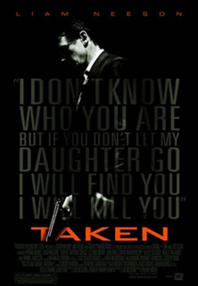
  The last poster included in the gif is significantly different in design to the other two. Although it is darkly coloured; the background is black, the text is grey and the image of the main character used is also darkly lit. This poster is my favourite of the three because the image of a familar character in the film is used and a phrase from the film is layered over this picture to tell the reader about something that happens in the film and to make them stop for a second and read "I don't know who you are but if you don't let my daughter go I will find you and I will kill you". Not only do I like the use of speech from the film, I also like the positioning and design of the title of the film which is located at the bottom of thesised in orange/red text in stark contrast to the dark colour scheme of the entire poste
The posters for the film 'The Shining' differentiate in style and the aspect of the film that they focus on and illustrate. I have made a gif demonstrating three of the most famous posters for the film. Each poster is quite different; one shows the face of the main character with a menacing and frightening pose. The other includes an image of the lifts being flooded which is a key event in the film and the final poster shows the iconic image of the 'Here's Johnny!' moment where he appears through a hole in the wall to his wife.

After looking at the text used in each poster it is clear that the same font and colour is used for the words 'The Shining'. By using the same text and making the font red, is makes the name of the film more memorable for the audience when they see it advertised in other places and the red connotates the danger in the film. My favourite poster of the three would be the one which is simple and focuses on just an image of the main character's face. I like it because it isn't a complicated poster and allows the audience to focus on the title of the film and the face that is see almost growling at them! The colours are dark and allow for the text which is in red and white to stand out. The director of the film is mentioned above the title and the names of the two main actors in the film are shown below the image.
No comments:
Post a Comment