Labels

Showing posts with label Ancillary Task: Poster. Show all posts

Tuesday, 27 March 2012

27/03/2012 - Making the Poster

This is the image that we will be using for the poster for our film 'Seized' and it follows our rough design of the poster where an image of the abductor's legs can be seen in front of a stair case.


We used Adobe Photoshop CS4 to edit the image and to create the poster.  We decided to remove the window frame from the upper right hand corner of the image as it did not film the hellish image that we wanted to create. To intensify the orangey/red colours we adjusted the contrast and brightness until we reached the perfect shade. By changing the colours we also made the legs of the abductor look like a silhouette just as it does in the trailer.

To remove the window frame we used the 'Blur Tool' and smudged the window away and painted over it with the 'Brush Tool' in white as it would be the lightest part of the wall. We then made sure that the white comfortablely ran into the orangey colours on the wall. The use of these shades of orange/red gives the appearance of a hellish location and makes the abductor even more intensified as the villain in the film.
As you can see in this print screen we continued to brush the colour in areas that needed a more thorough colour and to the left of the figure at the side in the centre, you can see where we began to brush this area orange.

This print screen simply shows the outcome of painting the appropriate areas orange/yellow/white to make the background against the figure more prominent.
As you can see the text on the poster is situated at the top of the poster (title and phrase) and the film details and located at the bottom underneath the abductor's feet. We decided to use the same font for continuity as it is also featured like this in the trailer. We made the title an orange colour as it could be seen easily and was relevant to the orange colour scheme.

The print screen below is the text from one of the 'Taken' film posters that I researched as we saw that a lot of film posters have this writing about copyright and details about the film at the bottom of the poster, we decided that this was a necessary convention to include.


 Following on from my previous research into film posters, I have taken a sample from the top of the 'Sixth Sense' film poster and as you can see we have taken inspiration from the white text and the positioning of the text at the top of the image. 

This is our FINAL poster!!
We decided to change the phrase 'A Modern Cat & Mouse' to something more dramatic like 'An Innocent Walk Home Becomes A Cat & Mouse Game' as it seems more poignant and will attract the audience to the ominous phrase.
This is a sample of the text from one of the 'Taken' film posters with a phrase from the film. We decided to include a phrase underneath the title as it is relevant to the film trailer and will become memorable to the audience. However, we did not choose to include a film rating on the poster as none of our research into film covers showed this and putting one onto ours would not be supported or perhaps necessary.

Thursday, 15 March 2012

15/03/2012 - Second set of photos for Poster

After taking the first set of photographs for our film poster and finding that they were either too dark or too blurry, we decided to reshoot them. This time, we used a tripod to hold the camera still and did not use flash, but increased the lighting instead. We are happy with the outcome of these images and look forward to picking a one for our poster!


Wednesday, 14 March 2012

14/03/2012 - Poster Text

While preparing to make our film poster we also needed to research into the text that is included in typical film posters as well as just looking into the images used. As we knew the rough design for our poster would feature the abductor's legs in front of the stair case with an orange glow, we decided to look at a similar poster - 'The Sixth Sense'. The poster has a simple layout; an central image, dark back ground, white text which stands out and the title and the main actor's name.
I have focused on the text and I like the writing as it has an eery feel and is also child-like in terms of the font which could be related to the child character in the film. By only including the the title of the film and the main actor's name it adds more mystery to the actual film and audiences who may be aware of the actor Bruce Willis may decide to watch the film because he is a famous actor.


Here is the french poster for the film 'Taken' which we have also focused on during poster research. The imagery used for this poster is somewhat more complicated than that of the film 'The Sixth Sense' and therefore the text is more prominent in order to remain bold in this more structured layout. As you can see, the name of the main male character is included because he is a film actor and an audience may be more inclined to watch it if they know who is in it. However, in our movie poster I do not think we will include a name as we want to keep the text simple and almost not give away anything. There is also text underneath the name detailing events from the film and text at the bottom of the poster which show the legal details and names of the those involved in the production of the film. 
  I have chosen to focus on the title of the film which is located to the left of the poster and is a main convention. The text is written all in upper caps and positioned horizontally. As I have seen in my previous research, the colour red is a common colour used for the title of a film in thriller/horror films.

Tuesday, 13 March 2012

13/03/2012 - Rough Plan for the Poster

I have drawn a rough plan of our ideas for our film poster in pencil. It is perhaps difficult to see but we scanned it in to photoshop and tried to make it darker so that it can be viewed better.


Monday, 12 March 2012

12/03/2012 - Editing for the Film Poster

The screen shot below shows how I opened the chosen image up in Adobe Photoshop CS4 and began to alter the photograph for our film poster. I adjusted the brightness and contrast to make the image seem darker and to keep the figure dark and the background orange. I then tried to darken edge at the bottom of the image but found that this was unsuccessful in creating the look that I wanted.


Here is the image that we will be using to manipulate the design of our film poster. We have decided that we want the waist down of our abductor in the film seen standing at the doorway, positioned in front of the stair case for the poster. We have taken inspiration from the poster for the film 'The Sixth Sense' as it is simple yet effective. In the poster shown below, there is a figure of a child and an orange glow around him. The person looking at the poster is instantly drawn in to the focal point in the centre and an ominous mood is set by the poster.
For the film poster, I feel that it is necessary to retake the image but use a tripod to position the camera still so that the photograph being taken is not blurry or shaken. We will also make sure that the window to the right of the figure is not present and that the image is more structured.

Tuesday, 6 March 2012

06/03/2012 - Initial Poster Ideas & Photographs


Here is a collection of shots of the abductor's legs standing at the door way in front of the stair case that he is seen creeping up in the trailer. The pictures above are perhaps too light and we have decided that we want to keep the idea of his legs for the poster but have them dark and create an orangey glow in the background.


We did discuss the idea of using an image of the abductor walking up the stairs from a low angle but we feel that it does not have the effect that we were hoping for and would not work well for a poster.

This image is slightly better but it is too light and does not have a significant appeal for the use in a poster to advertise a thriller film.

Tuesday, 15 November 2011

03/02/2012 - Film Poster Research

make gif
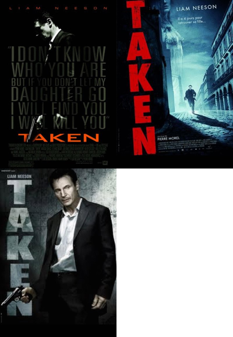
The second part of our ancillary task is to produce a poster for our film 'Seized'. The poster for a film is an important aspect in promoting it to a wide audience and selling the film as a 'must see'. Below is three different posters which were produced for the action-thriller film 'Taken'. Throughout the production of making our film trailer we have focused upon the creation of the film 'Taken' and have therefore decided to look at the posters for the film. One of the posters is a French poster which has the words 'Il a 4 jours pour retrouver sa fille...' which translated into english means 'He has four days to find his daughter' giving the observer of this poster a clue as to the storyline in the film. Although the film is in English, it is set in France so therefore the producers of this film have chosen to make a poster which will appeal to a french audience. This poster shows the main male character running through the streets of Paris where his daughter has been abducted. He is shown to be running and to the left of this image is a faded image of his daughter to remind us what the film centers around. In bold, red text, the title of the film 'Taken' is written vertically to the left of the poster which immediately grabs the attention of the person reading it. I like this poster but I feel that it would be difficult to produce a poster similar to it as ours is less action packed, however I do like the use of another faded image layered on top of the existing image.

Another poster which was made for the film 'Taken' shows the protagonist male character as the focal point and image of the poster. He is seen holding a gun and dressed smartly in a suit with a look of determination to find his daughter. I am not fond of this poster as it looks rather dull and the colour scheme is mainly greyish washed out colours. I feel that it does not attract my attention and if anything it perhaps puts me off wanted to watch the film because I would suspect that it is a film which requires a lot of my attention and thought or could be a male type film purely about action and not a lot about a story line. I do like the similar use of placing the title of the film vertically to the left of the poster and the title written in bold letters.

The last poster included in the gif is significantly different in design to the other two. Although it is darkly coloured; the background is black, the text is grey and the image of the main character used is also darkly lit. This poster is my favourite of the three because the image of a familar character in the film is used and a phrase from the film is layered over this picture to tell the reader about something that happens in the film and to make them stop for a second and read "I don't know who you are but if you don't let my daughter go I will find you and I will kill you". Not only do I like the use of speech from the film, I also like the positioning and design of the title of the film which is located at the bottom of thesised in orange/red text in stark contrast to the dark colour scheme of the entire poste
how to make a gif
The posters for the film 'The Shining' differentiate in style and the aspect of the film that they focus on and illustrate. I have made a gif demonstrating three of the most famous posters for the film. Each poster is quite different; one shows the face of the main character with a menacing and frightening pose. The other includes an image of the lifts being flooded which is a key event in the film and the final poster shows the iconic image of the 'Here's Johnny!' moment where he appears through a hole in the wall to his wife.
After looking at the text used in each poster it is clear that the same font and colour is used for the words 'The Shining'. By using the same text and making the font red, is makes the name of the film more memorable for the audience when they see it advertised in other places and the red connotates the danger in the film. My favourite poster of the three would be the one which is simple and focuses on just an image of the main character's face. I like it because it isn't a complicated poster and allows the audience to focus on the title of the film and the face that is see almost growling at them! The colours are dark and allow for the text which is in red and white to stand out. The director of the film is mentioned above the title and the names of the two main actors in the film are shown below the image.