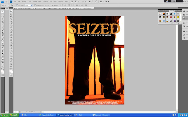
This is the image that we will be using for the poster for our film 'Seized' and it follows our rough design of the poster where an image of the abductor's legs can be seen in front of a stair case.
We used Adobe Photoshop CS4 to edit the image and to create the poster. We decided to remove the window frame from the upper right hand corner of the image as it did not film the hellish image that we wanted to create. To intensify the orangey/red colours we adjusted the contrast and brightness until we reached the perfect shade. By changing the colours we also made the legs of the abductor look like a silhouette just as it does in the trailer.
To remove the window frame we used the 'Blur Tool' and smudged the window away and painted over it with the 'Brush Tool' in white as it would be the lightest part of the wall. We then made sure that the white comfortablely ran into the orangey colours on the wall. The use of these shades of orange/red gives the appearance of a hellish location and makes the abductor even more intensified as the villain in the film.
As you can see in this print screen we continued to brush the colour in areas that needed a more thorough colour and to the left of the figure at the side in the centre, you can see where we began to brush this area orange.
This print screen simply shows the outcome of painting the appropriate areas orange/yellow/white to make the background against the figure more prominent.
As you can see the text on the poster is situated at the top of the poster (title and phrase) and the film details and located at the bottom underneath the abductor's feet. We decided to use the same font for continuity as it is also featured like this in the trailer. We made the title an orange colour as it could be seen easily and was relevant to the orange colour scheme.
The print screen below is the text from one of the 'Taken' film posters that I researched as we saw that a lot of film posters have this writing about copyright and details about the film at the bottom of the poster, we decided that this was a necessary convention to include.
 Following on from my previous research into film posters, I have taken a sample from the top of the 'Sixth Sense' film poster and as you can see we have taken inspiration from the white text and the positioning of the text at the top of the image.
 This is our FINAL poster!!
We decided to change the phrase 'A Modern Cat & Mouse' to something more dramatic like 'An Innocent Walk Home Becomes A Cat & Mouse Game' as it seems more poignant and will attract the audience to the ominous phrase.
This is a sample of the text from one of the 'Taken' film posters with a phrase from the film. We decided to include a phrase underneath the title as it is relevant to the film trailer and will become memorable to the audience. However, we did not choose to include a film rating on the poster as none of our research into film covers showed this and putting one onto ours would not be supported or perhaps necessary.


No comments:
Post a Comment